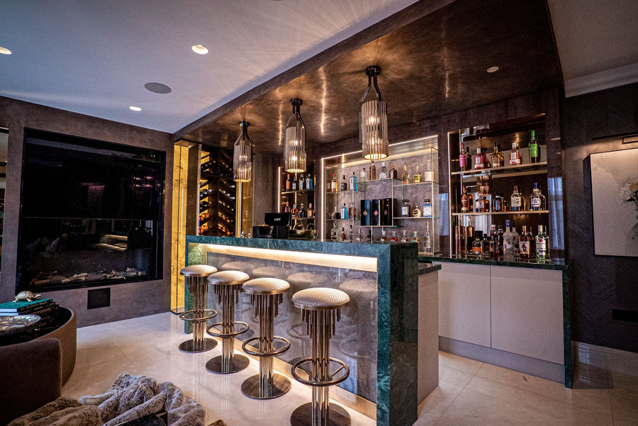

A beautifully made accessory can lose its presence when it is placed simply because there is an empty surface to fill. The question of how to style luxury accessories is therefore less about adding decoration and more about directing the eye, supporting the architecture of a room and giving meaningful objects their proper place. A hand-cut crystal vessel, sculptural bronze, rare stone box or finely bound art book should feel discovered within an interior, not distributed across it.
Luxury interiors gain their character through restraint as much as acquisition. The most considered rooms leave space around exceptional pieces, allowing material, silhouette and craftsmanship to register. Accessories provide the final layer of a scheme, but they should also be part of the design logic from the outset.
Begin with the Room's Architectural Character
Before selecting or arranging a single object, consider the room's proportions, natural light and fixed finishes. A polished marble fireplace, deeply veined stone floor or dark timber panelling already carries visual weight. Accessories in these settings need to respond to that strength, rather than compete with it.
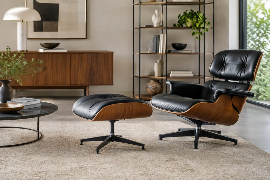
In a contemporary architectural space with clean lines, one substantial sculptural object may be more effective than several smaller decorative pieces. A more classical drawing room, by contrast, may accommodate layered objects with historical reference: a pair of urns on a mantelpiece, a framed object beneath a glass cloche, or books selected for their binding as well as their content. The principle is not to imitate a period, but to establish a conversation between the building, the furniture and the pieces placed within it.
Scale is the first discipline. Accessories that are too small for an expansive console or a grand coffee table tend to look incidental. Conversely, an oversized arrangement on a delicate occasional table can obscure its form and make the room feel overworked. Measure the surface, then assess the object from the principal viewing position. What feels impressive at close range may disappear from across a large reception room.
How to Style Luxury Accessories Through Proportion
Professional styling relies on relationships rather than isolated objects. On a console, for example, a tall ceramic vessel can anchor one side, balanced by a lower grouping of books and a tactile object on the other. The two sides need not mirror one another. In fact, strict symmetry can feel overly formal unless the architecture itself calls for it.
A useful approach is to work with varied heights, but avoid a sequence that rises neatly like steps. Combine a vertical element, such as a lamp or branch arrangement, with a horizontal layer of books, then introduce a rounded or irregular form to soften the composition. The eye should travel comfortably across the arrangement.
Coffee tables require a different rhythm because they are viewed from above and used frequently. Create low, composed groupings that leave clear space for a drink, a book or conversation. A large tray can provide definition, particularly on a generously scaled upholstered ottoman, while a sculptural bowl or object gives the arrangement a focal point. Avoid treating every section of the table as display space. Function is part of refinement.
Give Fine Materials Enough Breathing Room
Luxury accessories often derive their value from subtle qualities: the translucency of alabaster, the depth of patinated metal, the hand-applied glaze of porcelain, or the grain of a rare timber. These details need light and negative space. Placing a precious object tightly among competing finishes can flatten its effect.
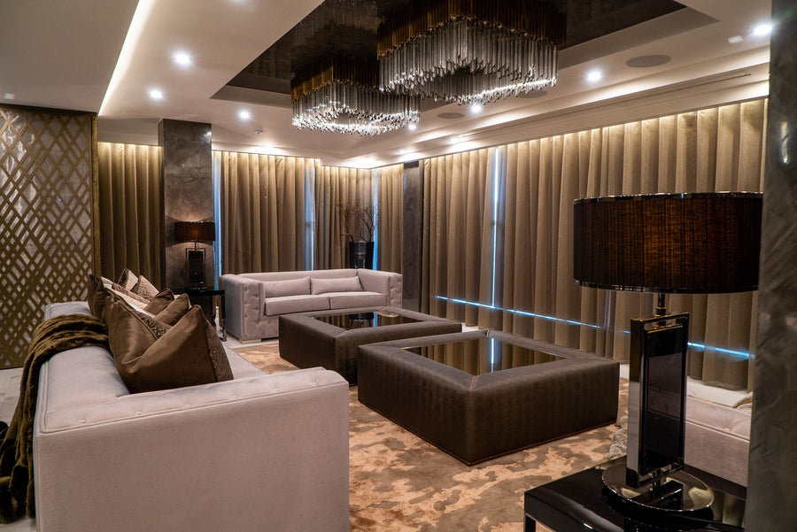
This is particularly relevant with reflective materials. A mirrored tray, polished brass candlestick and crystal object may appear rich individually, yet become visually restless when grouped together under strong lighting. Temper reflective surfaces with a matte counterpoint, such as leather, linen, honed stone or a softly textured ceramic.
Build Material Contrast, Not Material Confusion
The strongest accessory schemes have a limited material language. This does not mean every object must match. It means each finish should have a reason for being there.
In a room built around warm oak, bouclé upholstery and bronze detailing, consider accessories in smoked glass, travertine, parchment and dark-toned ceramics. The materials differ, but share an earthy, composed quality. In a cooler scheme of lacquer, pale stone and nickel, clear glass, white porcelain and restrained black accents may offer appropriate definition.
Repeating one material in several places can create quiet continuity. A small bronze object on a bookcase may relate to the base of a side table across the room; a burgundy leather box can pick up the tone of a chair's piping. These references need not be obvious. The most persuasive interiors often reveal their connections gradually.
Be cautious with accessories purchased as individual statements without a wider material framework. A room can contain fine pieces from respected makers and still feel fragmented if each introduces a different finish, colour temperature and design language. Editing is often the answer. Removing one or two objects can restore the clarity that an expensive collection deserves.
Use Colour to Create Depth
Accessories are an effective way to introduce colour without committing an entire room to it. Yet colour should be treated as a tonal decision, not a scattering of accents. A single oxblood vase can bring gravity to a neutral library; a deep green malachite object can sharpen a scheme of tobacco, cream and antique brass.
Rather than repeating one exact shade, work across a tonal family. A room with blue-grey walls might include inky glass, softened denim linen and a slate-toned stone object. This gives the scheme depth without making it feel coordinated in an obvious way.
Consider the changing light too. Dark glass and metallic finishes may appear dramatic in evening lamplight but recede during the day. Pale stone and translucent pieces often respond beautifully to daylight, particularly near a window or beneath considered picture lighting. Accessory placement should be reviewed at different times, not decided in one afternoon.
Style Each Surface for Its Actual Use
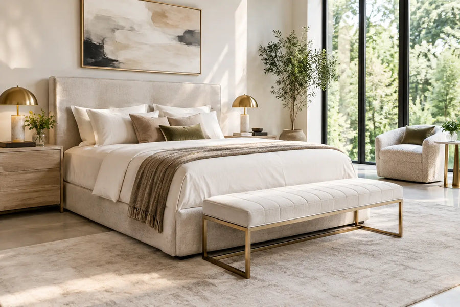
The most accomplished styling understands daily life. A bedside table needs a reading light, somewhere for glasses and a small dish for jewellery. A beautifully framed photograph or a single tactile object can add personality, but the surface should not become an obstacle at the end of the day.
In an entrance hall, accessories establish the first impression while serving a practical purpose. A substantial bowl can hold keys, a neatly edited arrangement of books can soften a console, and a lamp can introduce warmth after dark. The scale should relate to the approach through the space, especially in homes where an entrance is visible from a formal reception area.
Shelving benefits from a slower, more architectural method. Do not fill every shelf. Alternate books, objects and empty intervals, while considering the shelf as a whole rather than styling it compartment by compartment. Stack some books horizontally, stand others vertically, and allow one piece with a distinctive silhouette to interrupt the rhythm. Personal objects, including collected ceramics or travel mementoes, are most convincing when chosen for their material beauty and genuine relevance rather than their ability to fill a gap.
Treat Books as Cultural Objects
Books bring scale, colour and intellectual character to an interior. Choose volumes that reflect the household's interests, from art and architecture to fashion, gardens, travel or design. Their visual contribution matters, but authenticity matters more. A library looks persuasive when it has been assembled over time and remains available to be read.
Avoid arranging every book by colour if it compromises subject or usability. A restrained colour grouping may work on a decorative console, but larger collections are better organised with a degree of practicality. Beautiful bookends, a small object placed on a stack, or a linen-covered box can introduce order without turning the shelves into a display set.
Know When an Object Should Stand Alone
Not every accessory needs company. A monumental vessel in a stair hall, a singular work of ceramic art on a plinth, or an exceptional centrepiece on a dining table can be more compelling than a busy arrangement. This is especially true of handmade objects, where irregularity and process are part of the appeal.
The decision depends on the strength of the object and the visual demands around it. A finely detailed piece may benefit from a quieter surrounding, while a simpler bowl may need books, foliage or a tray to give it purpose. Styling is an act of judgement, not a formula.
Fresh branches, seasonal foliage and restrained floral arrangements can bring a room into contact with the outside world, but the vessel is as important as its contents. Select a form that works even when empty, and keep the scale generous enough to hold its own. Artificial arrangements rarely offer the same variation, movement or sense of occasion.
Edit with the Same Care as You Select
A finished room should not feel permanently finished. Objects can be moved between rooms, stored for a season or replaced with pieces collected over time. This keeps an interior responsive while protecting it from visual fatigue.
The final test is simple: each accessory should contribute proportion, material interest, memory or function. If it does none of these, it may be occupying space that would be better left clear. Thoughtful styling is not about displaying everything one owns. It is about allowing the right pieces to speak with confidence, and giving a home the depth that only personal, well-judged details can provide.
Touched Interiors
The Insider is written by the Touched Interiors design studio in Manchester, founded by Kunal Trehan in 2009 and named Interior Design Studio of the Year in 2024 and 2025. About the studio.